Reprising my offer from last week to design a book cover for the first person who had an image available, I got a medical thriller from @eigenseide. Here’s what she sent:


There are two complications here. First is that the title is still up in the air. We toss around some options and decide to go forward with “A Rash of Violence” to start.
The other complication is that the image, while beautiful, doesn’t say “medical” or “thriller” and only says “set in Mongolia” very, very subtly. And also it’s in landscape orientation. Books are in portrait and tend to need some neutral stuff at the top or bottom. Just, you know, in case you’re thinking of taking photos for use on a book cover. Word to the wise. I mock up something, but it’s not the direction I want to go, at all.
Here’s the medical thriller category on Amazon. Lots of red-and-white, and also a lot of bright light blue, interestingly. It probably calls on scrubs and antiseptic walls and that kind of thing.

Don’t be fooled by the patches of green; there are a couple Irish country doctor memoirs in there for some reason.
So I go looking for another image on my new favorite site. I see this one and get the idea immediately. It implies modern Asia, and crowds, and it’s hospital-white, and I think I can set apart one of the figures in a striking way, to represent disease in the middle of society.
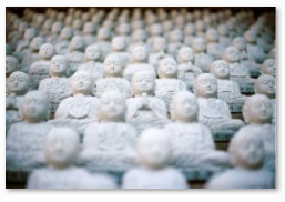
I duplicate that layer, turn it super-red, and erase the shape of the dude from an overlay of the original. I also retitle the book because neither of us are happy with the title yet and I’m arrogant that way.

These are…okay? I feel like the concept is good but the execution is lacking. I become paranoid that I saw the idea somewhere else and stole it by mistake. I start fiddling.

I’m making things worse. Time to break for dinner.
When I get back I decide to redo the concept. I use three layers (white figures in front, red figure in the middle, white figures in the back) and it makes the colorizing look a little more natural. I also don’t massively oversaturate the red layer. I’m not entirely happy with the pinkish tone, but I’m not able to make it darker red without making it look out of place. I assume a pro could do it.

We’re also talking about titles again, so I experiment.

Switching the author name to the top is making things worse again. I backtrack. The good news is, we’ve settled on a title.
 I vastly prefer the lowercase, because I think it looks more modern and stylish, even though I don’t know whether that works for a medical thriller. I want the central figure smaller, because I feel like at this size we’re losing that element of “infected figure in unsuspecting crowd” I was so proud of coming up with. Shrinking the image adds a dark space at the top, but luckily we’ve added a tagline to fill it up with.
 There’s a lot about this I’m not sure about. I add a fancy flair to the title, to reinforce the theme, though I’m not sure it works. Ultimately I send out two potential covers, and a bonus cover as an apology: the kind of book cover I’d use the original photo on.


This was super tough and I’m still not satisfied that I nailed it. What do you think? Which cover do you prefer? What kind of book would you assume this was, from the cover? What changes would you make to fit it more firmly in its category?
FONTS, “RASH”:
- DilleniaUPC Bold
- GulimChe (left)
- Gungsuh (right)
- Century Gothic
FONTS, “THE THRONE OF KHAN”:
- Century Gothic
- Arial
- Kokila Italic
- Centaur
IMAGE SOURCES:
- Statues: https://unsplash.imgix.net/photo-1421526053088-51b69c8a8d59?q=75&fm=jpg&s=2594d1cce8a2a50f1479112204c7ac72 via Unsplash
TIME TO CREATE:
- 5 hours in GIMP plus 1 hour for bonus cover, 1 hour researching and 1 hour fretting
See all my book cover designs here. Inquiries accepted.

January 26, 2015 at 11:01 am
Honestly, I really like the bonus cover best! Although you’re right that it doesn’t look like a medical thriller at all; it looks more like historical fiction or alt-history. But I do like the “statue” cover too, and I think it looks great. (I’d go with the one on the right. The other typeface just isn’t working for me.) Nice work!
January 26, 2015 at 11:18 am
I would make some changes to the title and the blurb on the bonus cover if it was going to be the final one, but I really like it too! Thank you! 😀
February 2, 2015 at 12:10 pm
[…] It’s easy to notice, but elegant and quick. (I did the same thing on the final blue cover, here.) I repeat that process, flipping them backwards and matching them up. Now I have more space to the […]